Name of Artist: Lyn Randle
Dates of Artist: Could not find
Personal Background: I was not able to find any information about her. According to google she is nonexistent and the only evidence I have that she actually exists is the credits at the bottom of the image. She sells all of her artwork to websites or people. She has quite a lot of pictures but for some reason I could not find anything about her besides her name. I don't know if she works by herself or for a company but a lot of the pictures that she takes are sold on pixels.com or are posted on websites.
Style: Lyn Randles art work is very old fashioned. Most of her pictures are of things like pocket watches, records, old mirrors and things like that. Even with her other pictures of the strawberries and the blueberries, the filters and backgrounds that she uses make the pictures look old. She uses a lot of fabrics for her backgrounds and the filters she uses often make the pictures look like drawings. I notices that she has several pictures of the same cross. In all of them there is an old man somewhere in the background.
Philosophy: Lyn Randle mostly makes artwork to either sell it online, for websites, or to promote her artwork. In a lot of her pictures there is a puddle of blood or a gun. Maybe there was something that happened to her or that has a lot of meaning to her that has to do with blood or a gun. Her artwork gives off this dark and mysterious feeling. I'm not sure what exactly the meaning behind her images is since I cannot find any information about her anywhere. The pictures that I chose don't portray this but the majority of her other pictures do.
Influences: Lyn Randle seems very mysterious to me since I was not able to find any information about her and her pictures portray the same sense of mystery. A lot of pictures use interesting lighting to bring attention towards a specific thing in her artwork. I learned that by just adding a light on a specific thing can draw in your audience. Her pictures are all very simple, usually there is just one object on a blanc background. Sometimes having less ends up being more.
Sources:
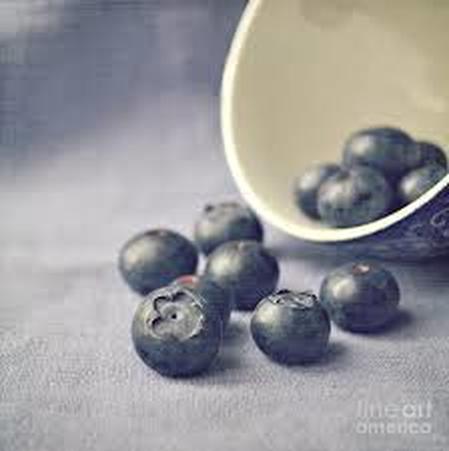
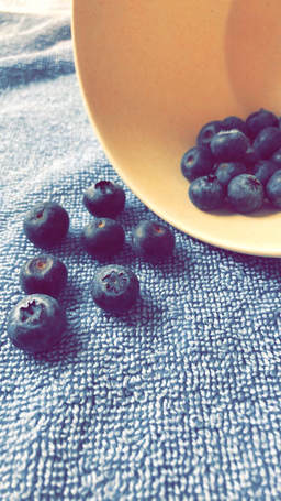
Bowl of Blueberries - pixels.com
Salt Shaker - orlandosentinel.com
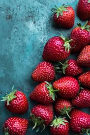
Strawberries - Pinterest.com
Bowl of Blueberries - pixels.com
Salt Shaker - orlandosentinel.com
Strawberries - Pinterest.com
Compare and Contrast:
Bowl of Blueberries - for the blueberries it was difficult to find the same background since it has a very specific color and texture. I ended up finding something similar that gives you the same effect of the blueberries being just a shade darker than the background. The lighting was one of the easier things since it looks like the light was just coming in from the left. Overall I think that the pictures both are very similar.
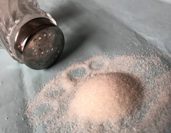
Salt Shaker - I chose to recreate the picture of the salt shaker because we already had the same exact salt shaker and I thought that it would be something that I could recreate well. The hardest part for me was probably getting the salt to create that pointed tip at the top of the pile of salt. The easy thing again, was the lighting.
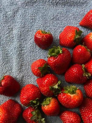
Strawberries - I could not find anything that was even close to the color of the background so I did my best to try and find the closest shade. I think that it still looks pretty similar with the strawberries but the background in the first one does make the strawberries look a little darker. The lighting was also difficult to get right fo this one since the natural lighting was very bright and in the picture I was recreating it doesn't look like there's as much light.
Bowl of Blueberries - for the blueberries it was difficult to find the same background since it has a very specific color and texture. I ended up finding something similar that gives you the same effect of the blueberries being just a shade darker than the background. The lighting was one of the easier things since it looks like the light was just coming in from the left. Overall I think that the pictures both are very similar.
Salt Shaker - I chose to recreate the picture of the salt shaker because we already had the same exact salt shaker and I thought that it would be something that I could recreate well. The hardest part for me was probably getting the salt to create that pointed tip at the top of the pile of salt. The easy thing again, was the lighting.
Strawberries - I could not find anything that was even close to the color of the background so I did my best to try and find the closest shade. I think that it still looks pretty similar with the strawberries but the background in the first one does make the strawberries look a little darker. The lighting was also difficult to get right fo this one since the natural lighting was very bright and in the picture I was recreating it doesn't look like there's as much light.
Personal Artist Statement: The pictures that I took were inspired by Lyn Randle. I knew that I wanted to do something with fruits like strawberries or blueberries and as I was looking though the different artists, Lyn Randle stood out to me the most since a lot of her other artwork is very different from things you would normally see. I think that I did a pretty good job recreating her images. It was difficult because I was trying to position the fruits exactly the same way and get the lighting and the background right. I think that I did a good job with the positioning and the lighting but if I had had the same background as in the original picture then I feel like my art work could have looked a lot better.
Resources:
1. pixels.com
2. pinterst.com
3. orlandosintenel.com
1. pixels.com
2. pinterst.com
3. orlandosintenel.com
|
|

|
|
|
|
